Product Design / User Research / Prototyping / User Testing
Timeline: 3 weeks, Tools: Figma
ParaPark is a map and parking app that allows users to quickly scope out the parallel parking situation for their desired location while also exploring alternative parking options nearby.
For those who are inexperienced with parallel parking, navigating downtown areas can be stressful and anxiety inducing.
It's hard to plan a day in urban areas when you don't know the parking situation and you struggle with parallel parking. Making plans now involves a whole project of not only finding out a business's parking situation, but also finding alternative options if there's only parallel parking available.
Create an app that helps drivers make parking decisions without having to cross-reference multiple apps at one time.
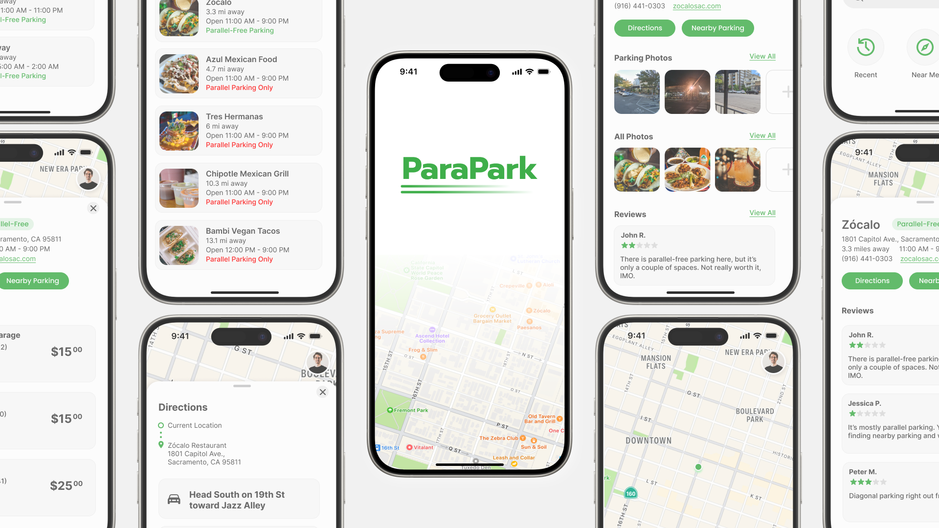
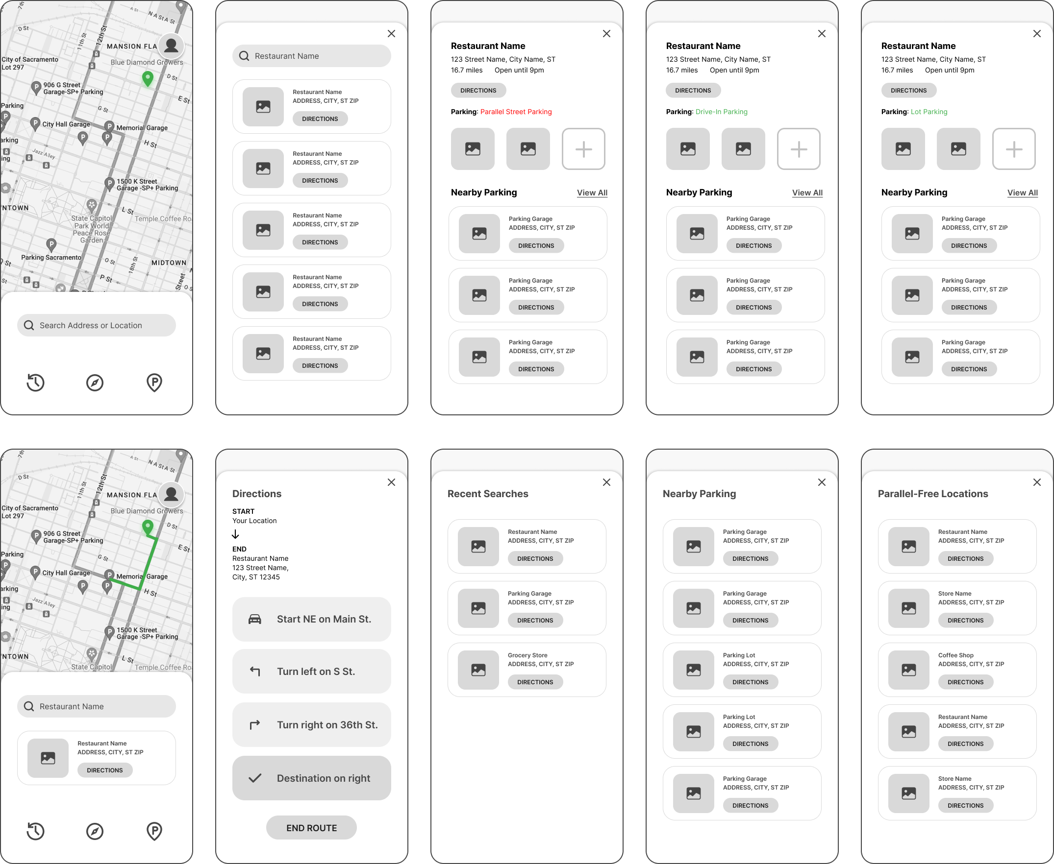
The start screen for ParaPark prompts the user to enable their location services which would allow the app to return results near them as well as enable the routing feature.
I wanted to be sure that the users could still interact with the app and find out parking and business information if they didn't want to jump into enabling location services, so I added a "skip this step" prompt in the first screen.
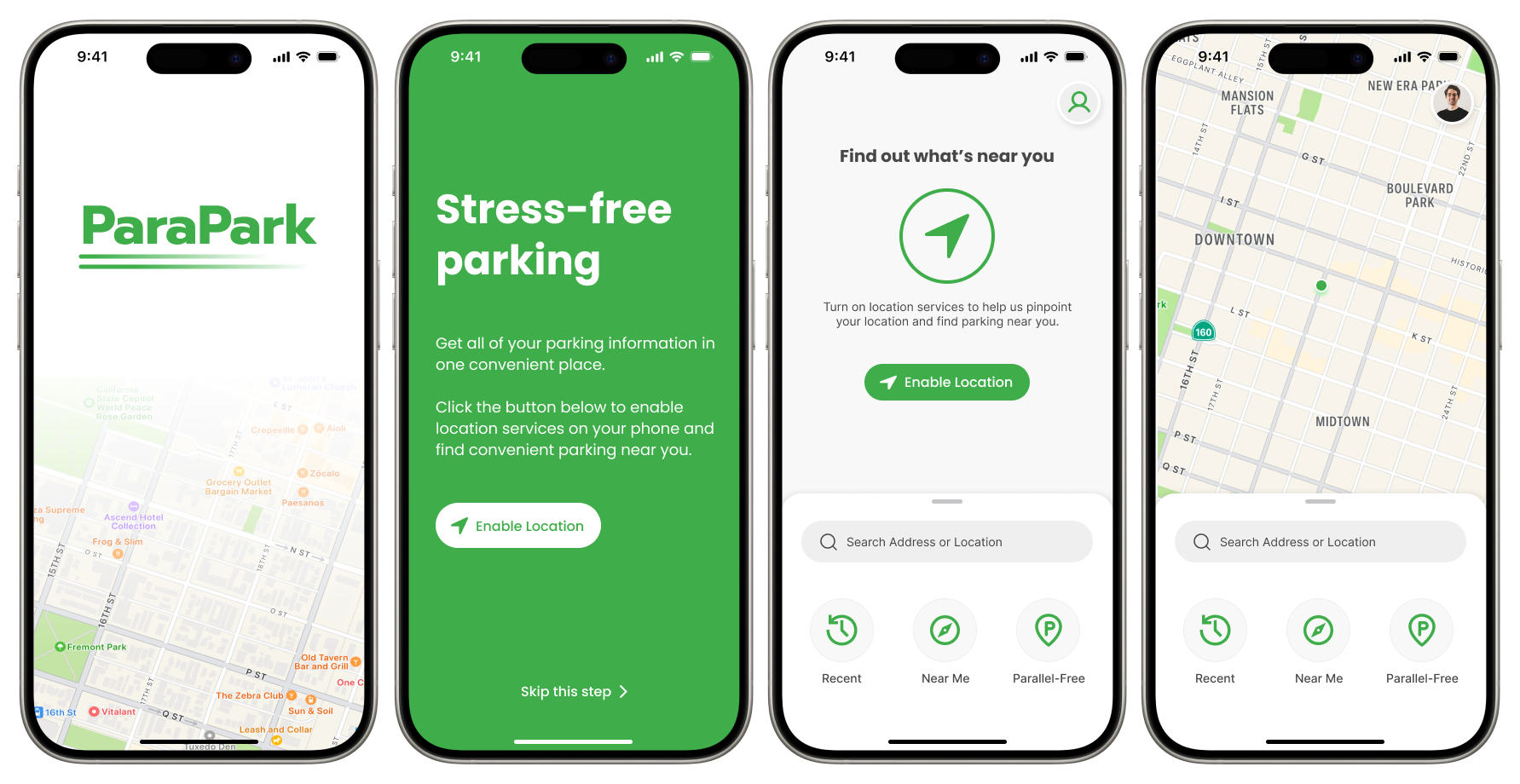
The search feature will return results that show the user the parallel parking situation for their desired location.
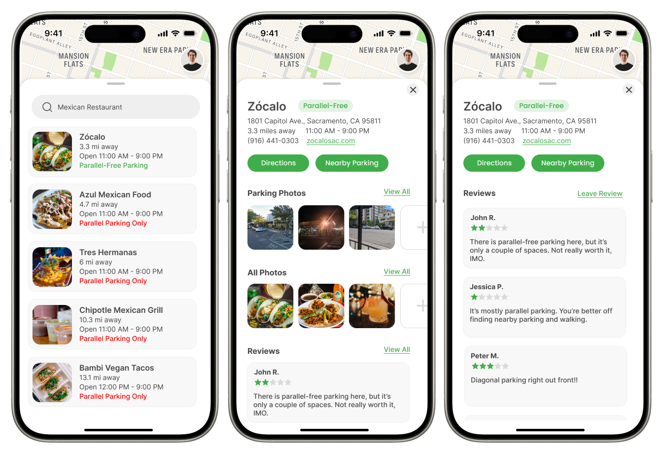
The user can also access additional information about the business by clicking on the business name. This will show not only the parallel parking situation, but also provide photos of the parking, reviews of what the parking is like, a link to nearby parking, and all other information related to the business. This allows the user to have an all-around idea of what they will experience when they reach their destination, leaving very little to stress about when making plans.
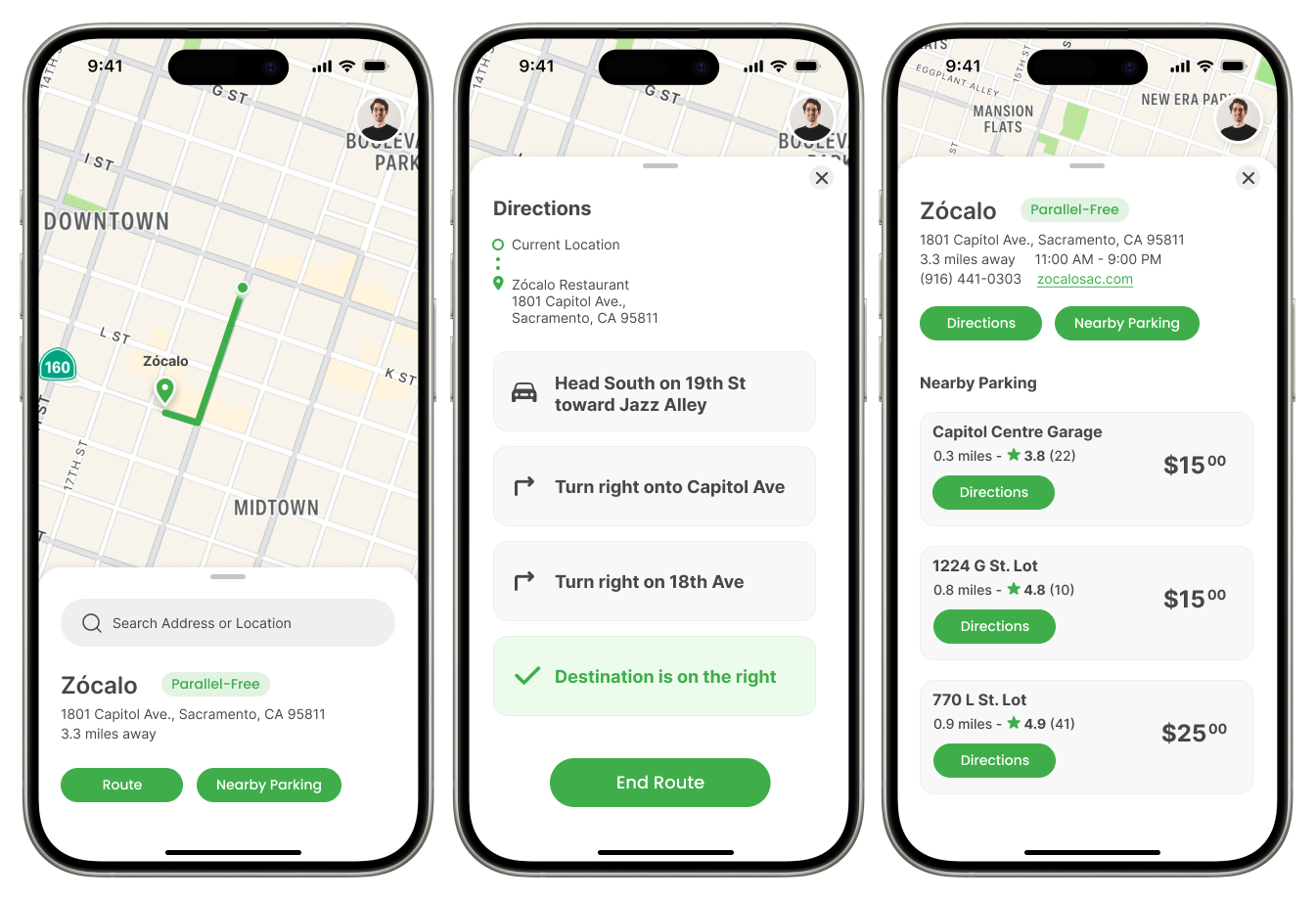
The routing feature allows users to navigate to their destination or find the nearest parking garage/lot if they’re not comfortable with the parking situation at their destination.
Prices are included in the ‘Nearby Parking’ screen to allow users to make the best choice within their budget. The navigation feature shows step-by-step instructions so that users have no trouble finding their destination. Before routing, users are still able to identify the parallel parking situation beforehand so that no parking surprises come up.
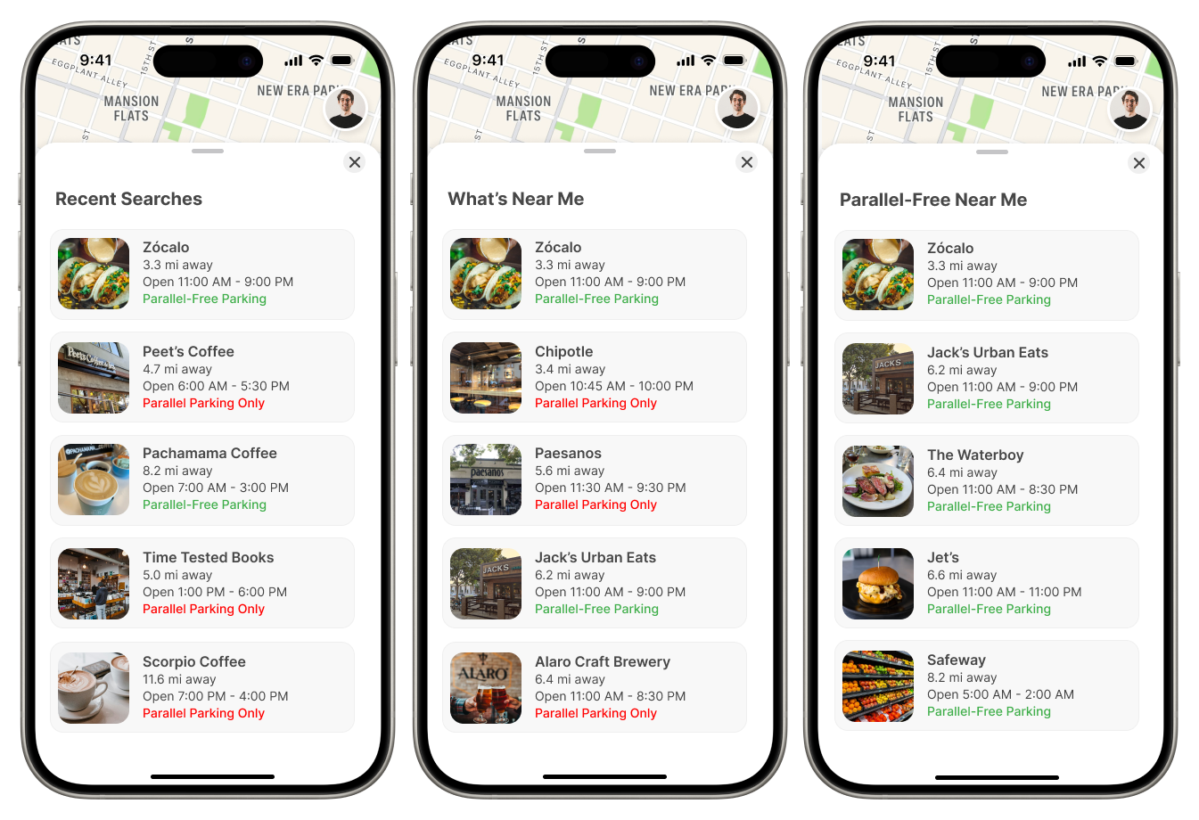
From the homepage, the user can find shortcuts to view their ‘Recent Searches’, what’s ‘Near Me’, and ‘Parallel-Free Near Me’.
These features allow the user to look back on past searches to easily navigate to a destination they liked before, search what’s near them to make easy choices on the fly, and find parallel-free parking situations where they won’t have to worry about parking at all.
My first task in working through the design process was to research the current mood and attitude surrounding parallel parking and why people are so against the method.
Nearly half of Americans suffer from "parallelophobia", which has been coined as the term for the fear of parallel parking.
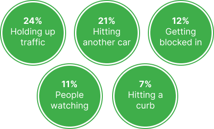
According to a study done by Zebra.com, it was found that 49% out of 1,000 people surveyed suffered from parallelophobia. They broke down the common fears as:
Only about 53% of people feel "very confident" in their parallel parking skills, and even in the northeast where drivers tend to be more comfortable with parallel parking, the percentage still sits at 61% from the people surveyed.
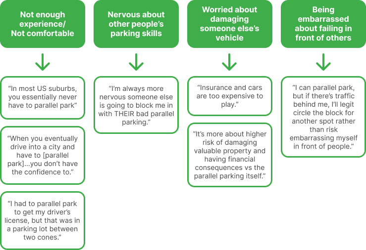
Thankfully, there are lots of discussions happening online about parallelophobia and how drivers in the US feel about parallel parking, as a whole. I collected quotes from drivers for my own research and used that to pinpoint the main fears that drivers in the US have with parallel parking:
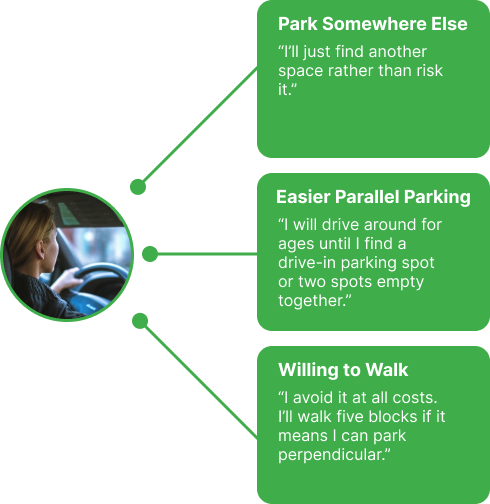
Many drivers would rather find alternative parking instead of facing the embarrassment or risks that come with inexperienced parallel parking. Some drivers are even going as far as walking longer distances if it means they will have an easier time parking their vehicle. This can lead to time wasted and a stressful experience for those who don't want to deal with parallel parking.
After researching the various issues and “solutions” that people have come up with for parallel parking, I decided to check if there was anything on the market that directly addressed the problem of parallel parking by digging into 3 popular map/navigation apps.
Going through the apps as someone who also struggles with parallel parking, I decided to look for 3 specific pieces of information that would help in determining the parking situation at chosen locations: General parking information, photos of parking, and visibility of parking information.
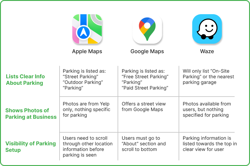
While some of the apps on the market today have some helpful parking information, none of them really put a focus on parallel parking or offer clear language on what type of parking is available. This can make it confusing for users to decipher what the parking situation will be when they arrive.
After learning about what drivers experience when faced with parallel parking situations, I decided to work on some low-fidelity wireframes to work out what would be essential in the design and experience within the application.
I had 3 friends test out the app and provide feedback on their experience or provide suggestions on what needed to be added to make the application more user-friendly/helpful.
This was my first time conducting user testing for an application that I designed. This provided a learning experience on the importance of details and appropriate labeling. A lot of the times, things that may seem obvious to the creator or longtime user will not alway transfer to someone experiencing something (and in this case, an app) for the first time. Adding in small details can make the difference between a pleasant user experience or a frustrating one.