Product Design / User Research / Prototyping
Timeline: 2 weeks, Tools: Figma
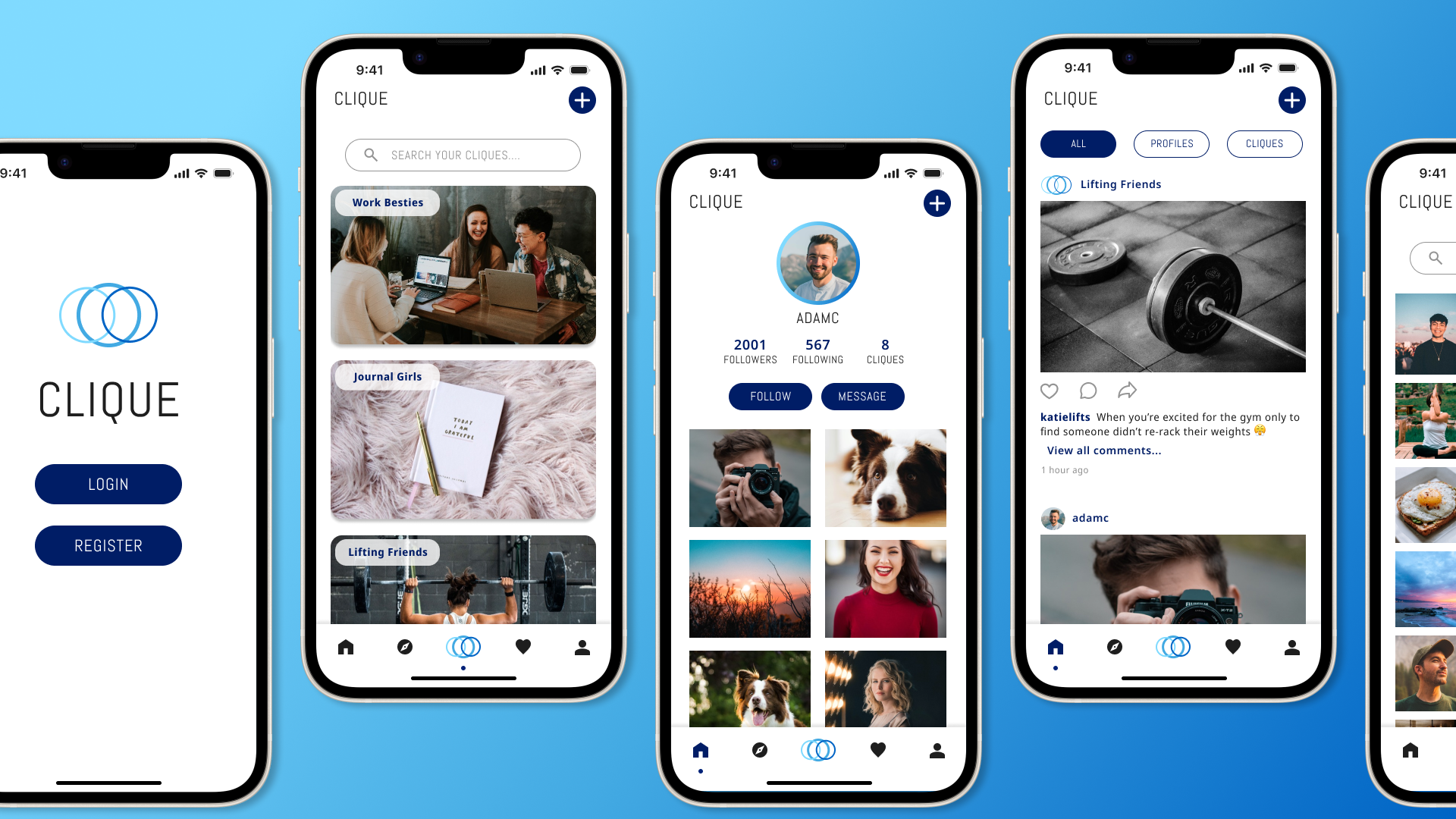
Clique is a photo-sharing social media platform designed to connect friends from various circles of their life while promoting the cultivation of new friendships.
Social media used to be a place where people could spend time catching up with friends, making new ones, or just sharing and enjoying bits of their lives.
Now it seems like popular social media platforms have changed or limited the way people interact with one another, resulting in less intentional and conversational engagement.
Design a social media app that brings the focus back to building social relationships with people and creating a community within one’s social media circle.
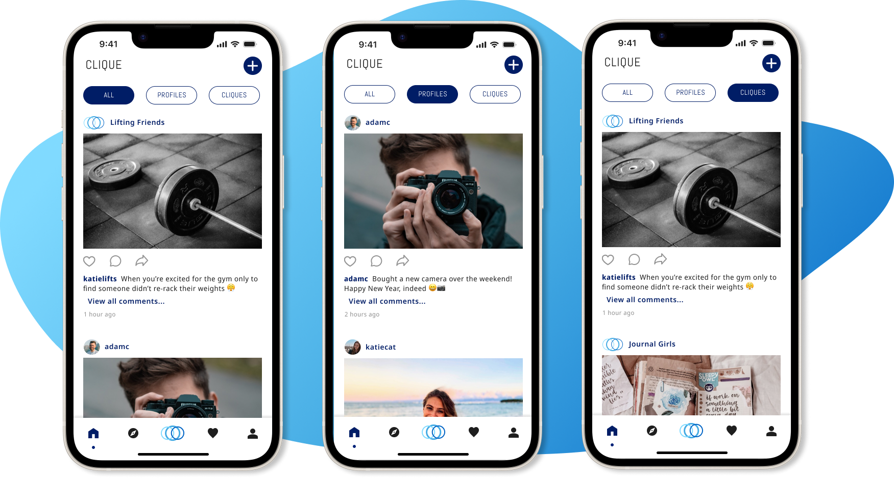
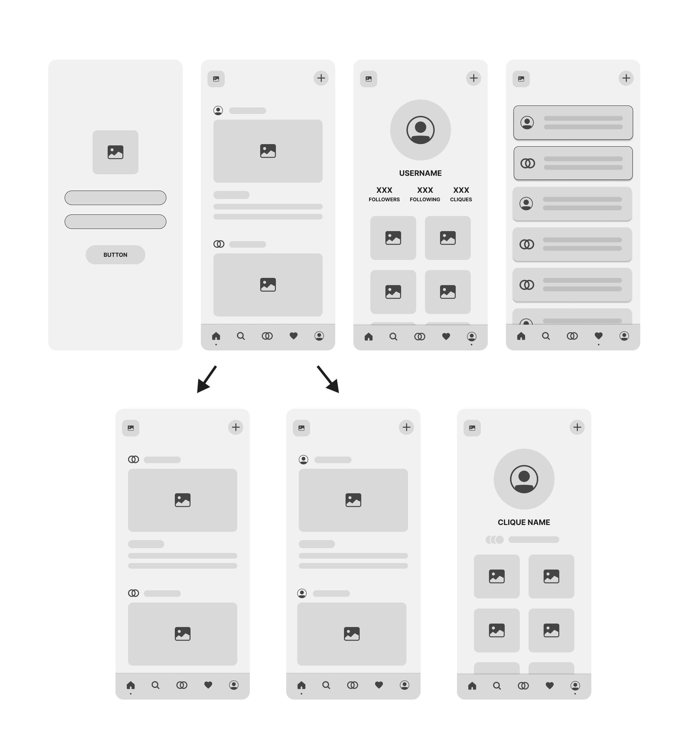
Clique showcases two different “follow” patterns for users, those being “Profiles” and “Cliques”.
The homepage (above) allows users to filter the type of posts they wish to see at any moment: all posts, profile posts, or clique posts. This feed is always shown to the user in chronological order by the latest post from a profile or clique that the user follows. This ensures that the algorithm does not control the content being displayed to the user and they can see only what they want on their homepage.
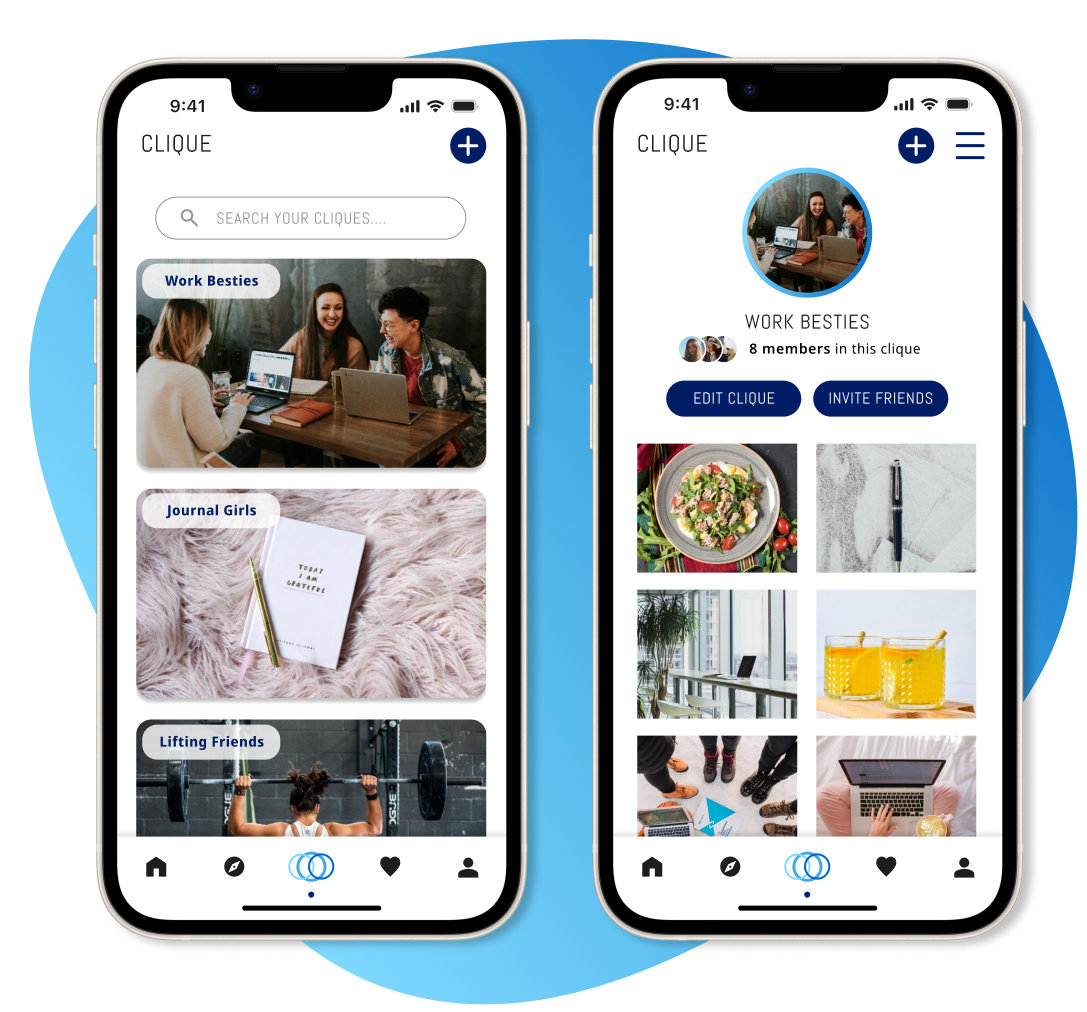
Cliques are groups — or “social circles” — that users are invited to join that only curate content for the users within that clique.
Generally, they are themed around a topic or friend group so that the posts can stay relevant to the interests of those in the clique. This allows a better handle on what kind of content is shared and limits the ability for spam/”troll” posts, or too many ads from influencers. Users must be invited to join a clique as opposed to requesting access. This ensures intentional invites and reduces the amount of spam invites that a clique might receive from letting users request access.
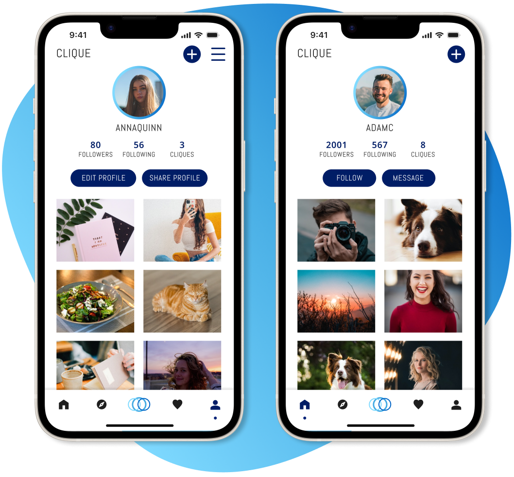
Profiles are the standard user profiles and the posts they choose to share with anyone/everyone on the platform.
This follows the same template that most social media platforms use by creating a general engagement with anyone on the app. This ensures that users are able to create and make new connections by searching posts or engaging with other users in the comments of a post.
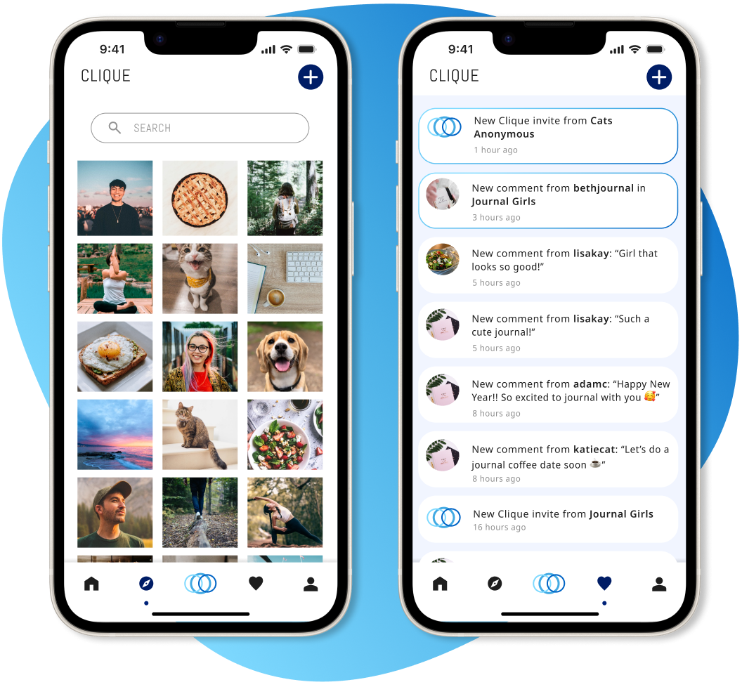
Users can utilize the explore page of Clique to find new friends and foster new connections.
This allows users to find profiles that better align with their interests. This notifications page lists both clique and profile notifications all in one place so the user is able to find everything they need. New notifications are shown with a border of the brand’s colors.
I decided to research and look into the activity of social media users and how that has changed over the years by surveying friends on Instagram. I surveyed 16 people, asking them what bothers them the most about modern social media:
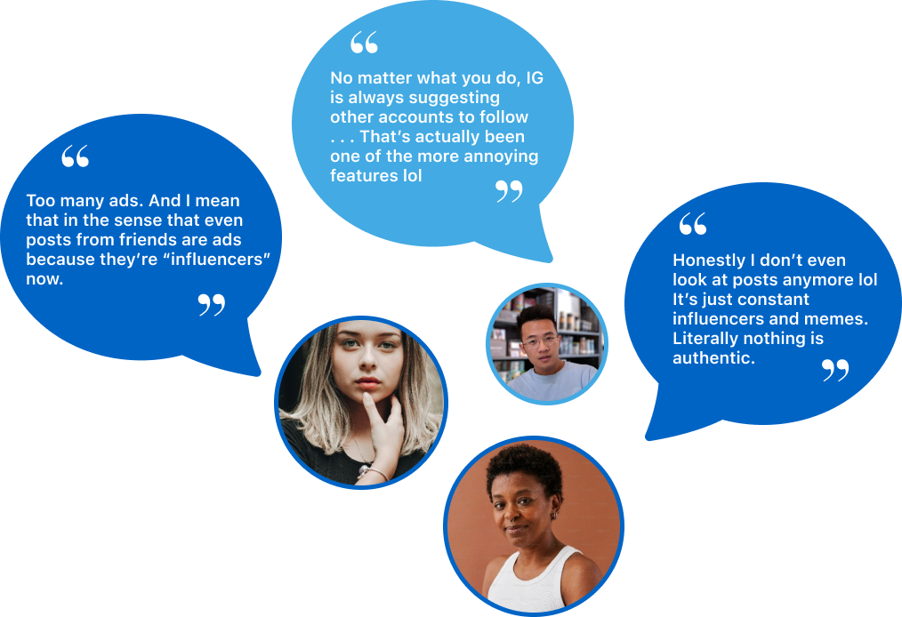

There were too many poeple wanting to make a quick buck rather than engage with their friends or make genuine connections and content. Posts and content came off as fake as opposed to a genuine reaction.
These included points like too many spam/bot accounts and general social media negativity, or “trolling”.

They were no longer seeing their friends’ posts and most of the things on their timelines/feeds were curated by algorithms and AI, as opposed to what they themselves chose to display on their accounts.
The social media template and repetitiveness of apps were getting to be too much and users felt like there was no longer any excitement from posting or interacting on social media.
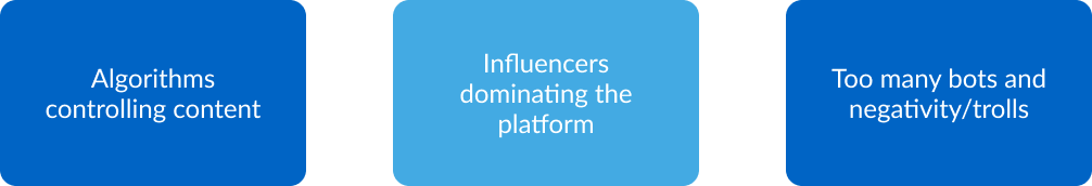
Connections are limited, and most people find that accounts are just trying to sell something instead of building a real social connection. Even after following accounts that are not focused on influencing or advertising, users are frustrated with the algorithms choosing content for them as opposed to being able to see what they originally signed up for. Comment sections are flooded with bots and negative “trolling” comments, as opposed to comments from their friends or peers on issues and content that are important to them.
I started by thinking about what main components a social app usually consists of and what new changes would need to be implemented to adjust for the current user pain points. Focusing on the main components of the social app (home feeds, profiles, and notifications), I wanted to make sure that users would have the ability to adjust their home feeds to display what content would be relevant to them:
I would have liked to conduct user testing with the current prototype to find any missing information or features that would contribute to the application allowing better social connections for the user. Would users find the filtering on the homepage useful? What annoyances can be found within cliques that could be improved upon? Is the message and goal of the app clearly presented and easy for users to relate to?
Sometimes small changes within an application can make a huge difference. Reinventing the wheel is great in theory, but can sometimes be unnecessary if the changes that are needed are minor issues that people experience. Through my user interviews, I found that most people had the same complaints that could be solved with simple adjustments to already popular apps.